Click through the full prototype above, or open it in Figma →
30-second summary
Problem
City data is technically public but unusable: buried in PDFs, split across departments, written for staff, not residents.
Approach
Solo concept work: two personas at opposite ends of civic engagement, grounded in real Baltimore legislation and budget records.
Key decision
Same information, two depths (skimmable vs. trackable), always sourced back to the original record: make the data legible first, let trust follow from that.
Status
Concept only. Not tested with real residents. City-impact case is reasoned, not measured.
The problem
Every city government I looked at technically makes its data public: council votes, budgets, 311 requests. Almost none of it is usable by the person it's supposed to serve. It's buried in PDFs, split across departments that don't talk to each other, and written for city staff, not residents.
One resident said it better than I could: "It's not about information overload. It's about information in the right format." The data existed. The interface to it didn't.
Two Baltimore residents, opposite starting points
Jasmine, the organizer
Runs community programs, already attends council meetings. Needs to track a bill from proposal to outcome without hunting across five city websites.
Jordan, the bystander
Doesn't vote locally, gets his news from Instagram and TikTok. Wants to know what's happening in his district without becoming an activist first.
Same information, two depths: skimmable for Jordan, trackable and shareable for Jasmine. Neither version could be the "real" one with the other bolted on.
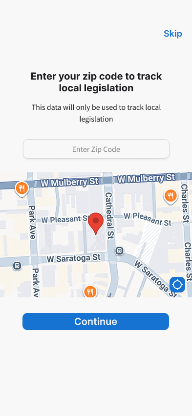
Five screens, one thread: real data, plainly shown
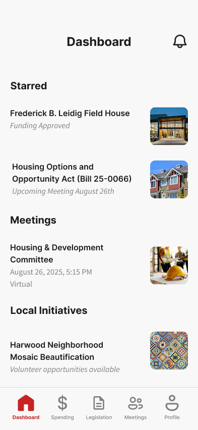
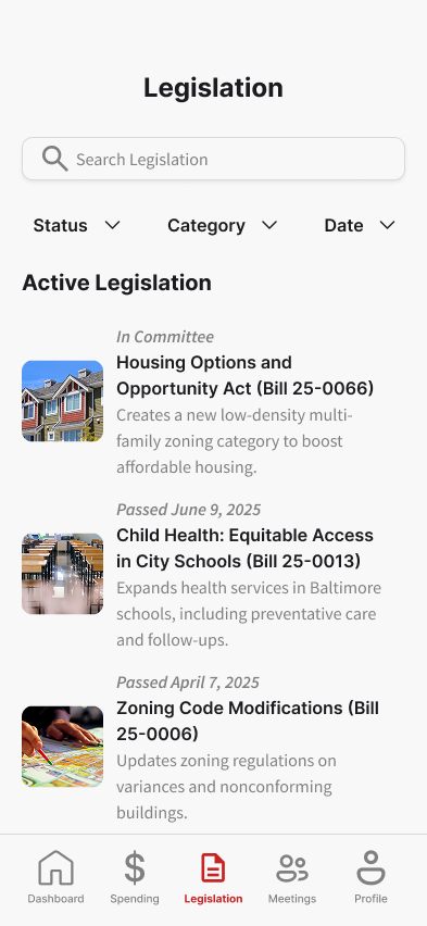
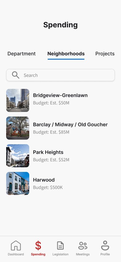
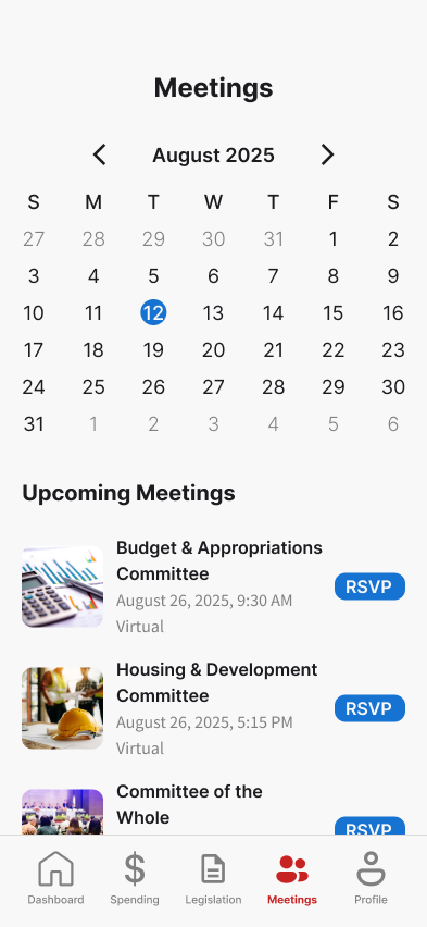
Why this would matter to a city
This never shipped to real residents, so there's no participation or trust data to cite. What I can show is which city-level goals each decision was actually built to move, and why.
Lower staff burden, not just resident convenience
Plain-language status next to a sourced link is aimed at the same "where's my money going" question that otherwise lands as a 311 call or a constituent-services email. A resident who can self-serve the answer is a repeat contact a city office doesn't have to staff.
Attendance and comments are what cities get funded on
Civic-engagement offices are often judged on two things: how many people show up to meetings, and how many public comments they get. One-tap RSVP and a dashboard that opens on what a resident already follows make it easier to do both.
Legible data as the thing being sold
Breaking the budget down by neighborhood matches what many city offices are already trying to show: that spending is distributed fairly across the city. And because the tool only shows sourced facts, not city talking points, residents have a reason to actually trust it instead of writing it off as another city PR push.
What I learned
Designing for civic tech was interesting because making the data transparent kept running into a trust problem. Show a rep's voting record and it can read as a smear. Personalizing by neighborhood can read as surveillance. The only real response was to push neutrality: sourced and plainly worded.
The primary limitation: this is unmoderated concept work, not something validated with Baltimore residents. My data is real though. The reactions to it can only be found through testing. A concept this dependent on earning trust needs to be tested with the people whose trust it's asking for.